
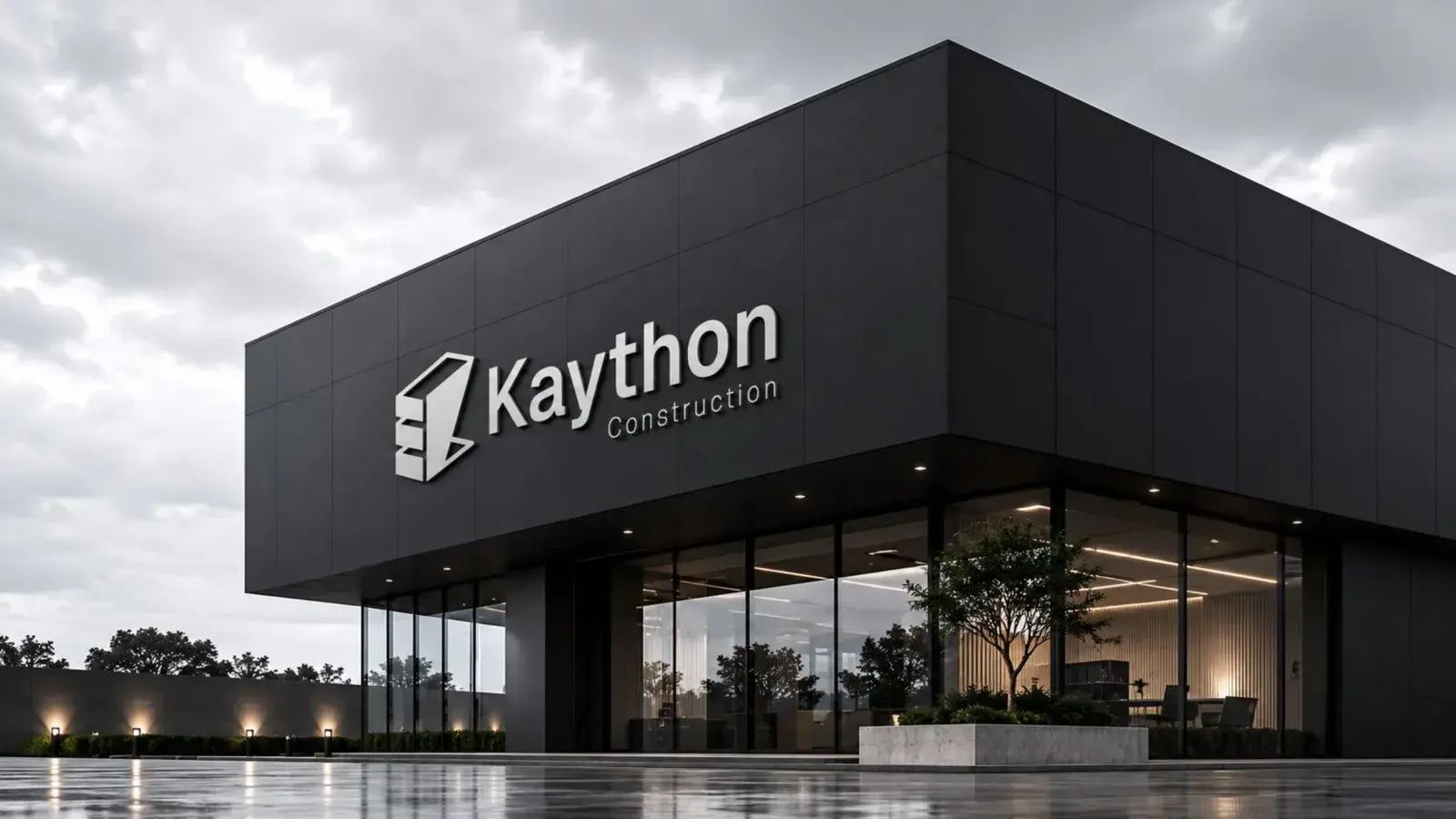
Kayton Construction
The Problem
The construction industry is highly competitive, with many brands relying on generic visual identities that fail to communicate their expertise, reliability, and quality of workmanship. Kayton Construction needed a visual identity that would differentiate the brand, communicate its British heritage and modern capabilities, and establish trust among clients seeking premium construction services.
The Response
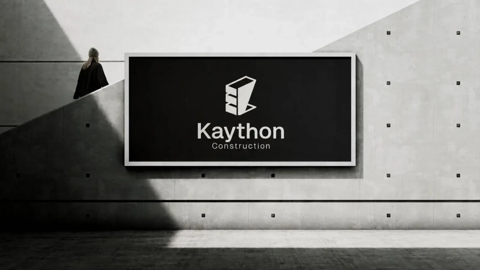
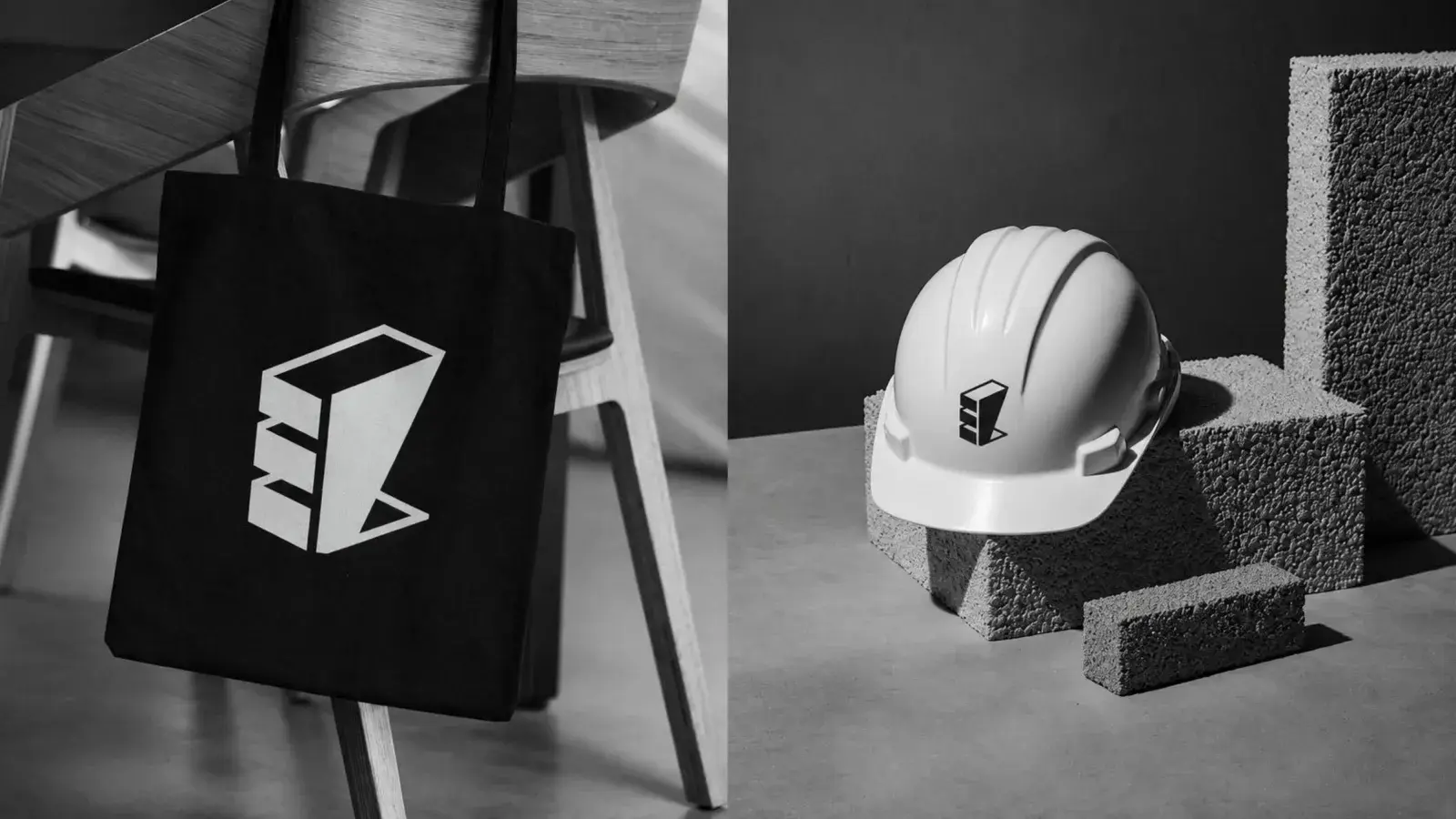
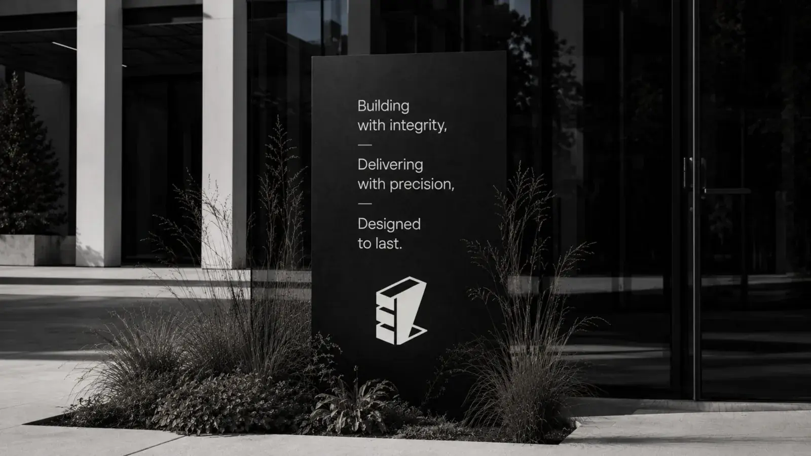
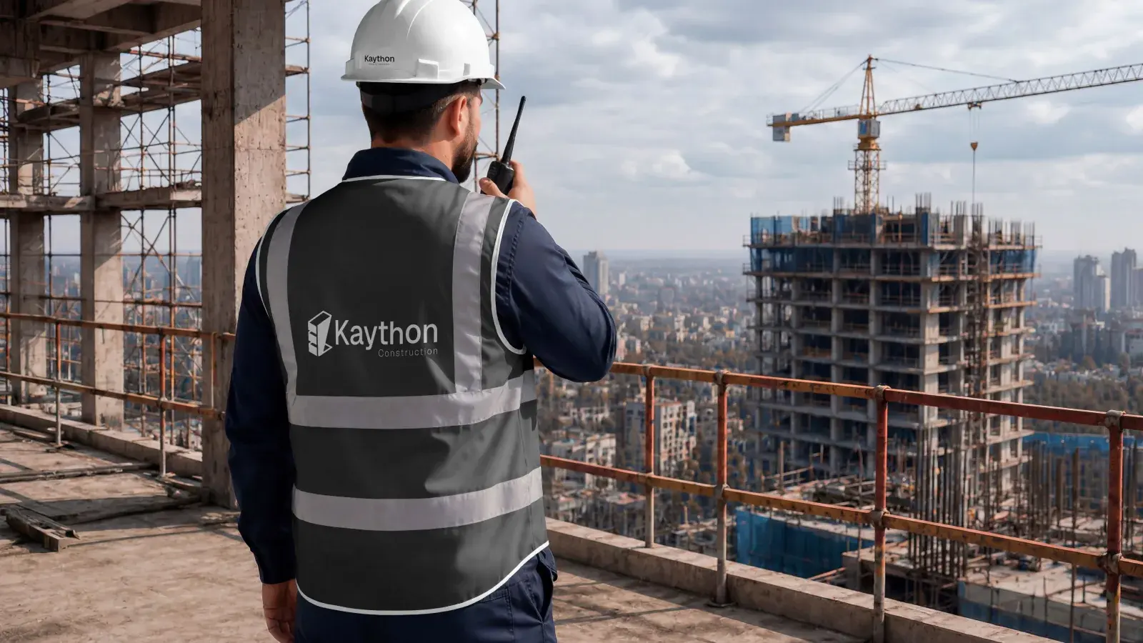
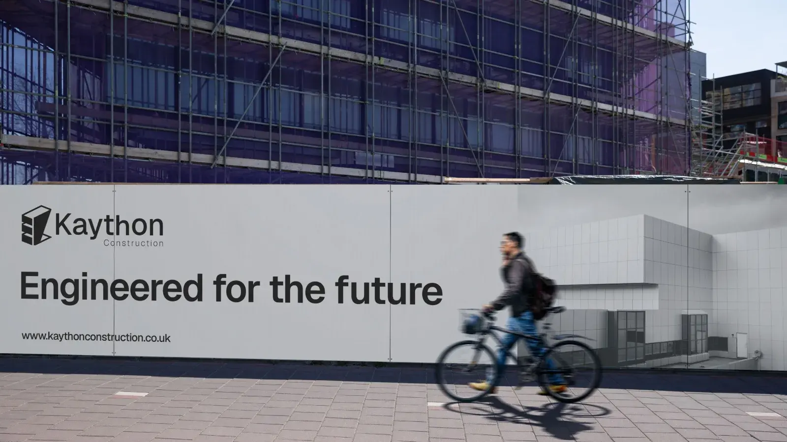
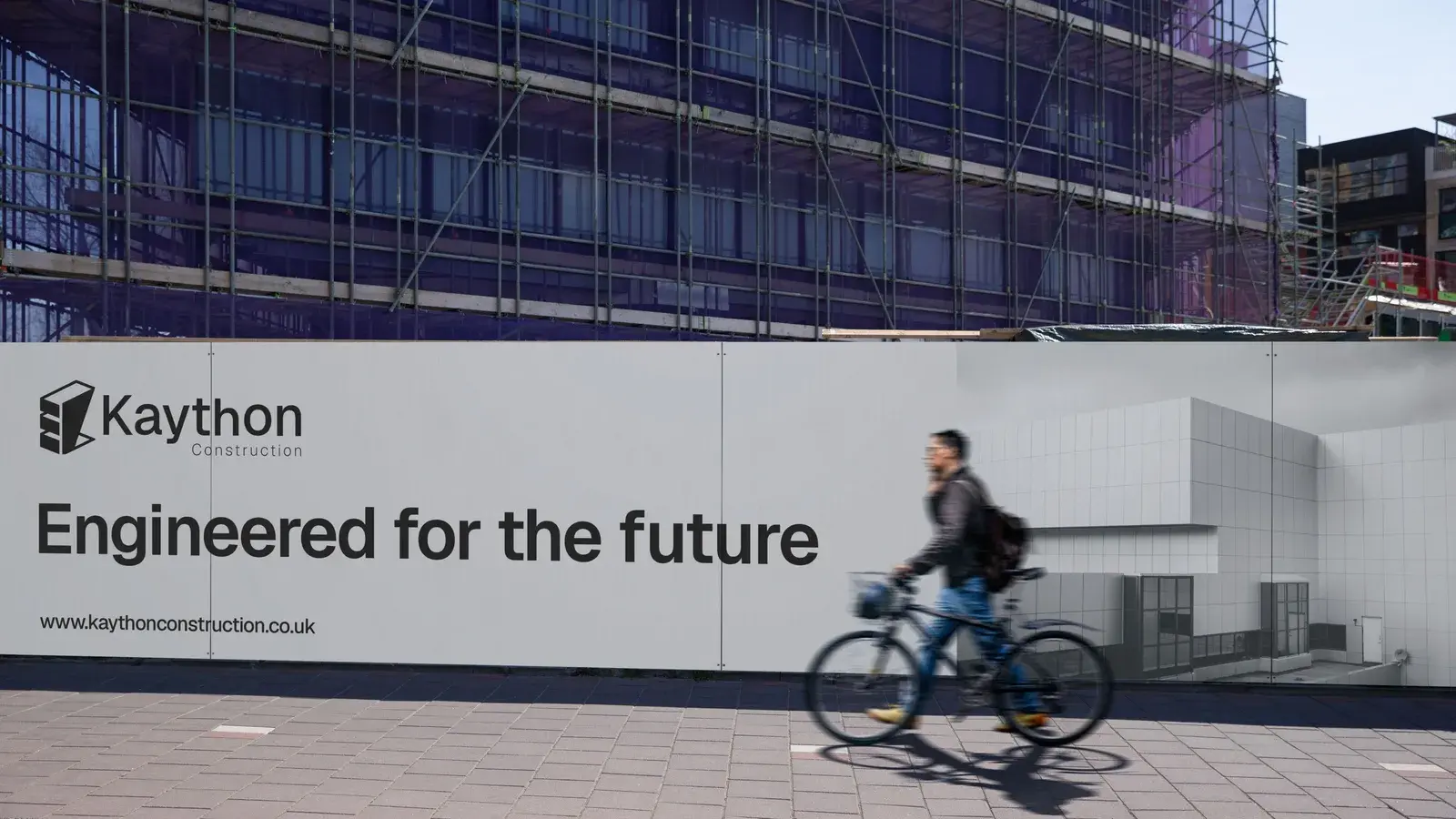
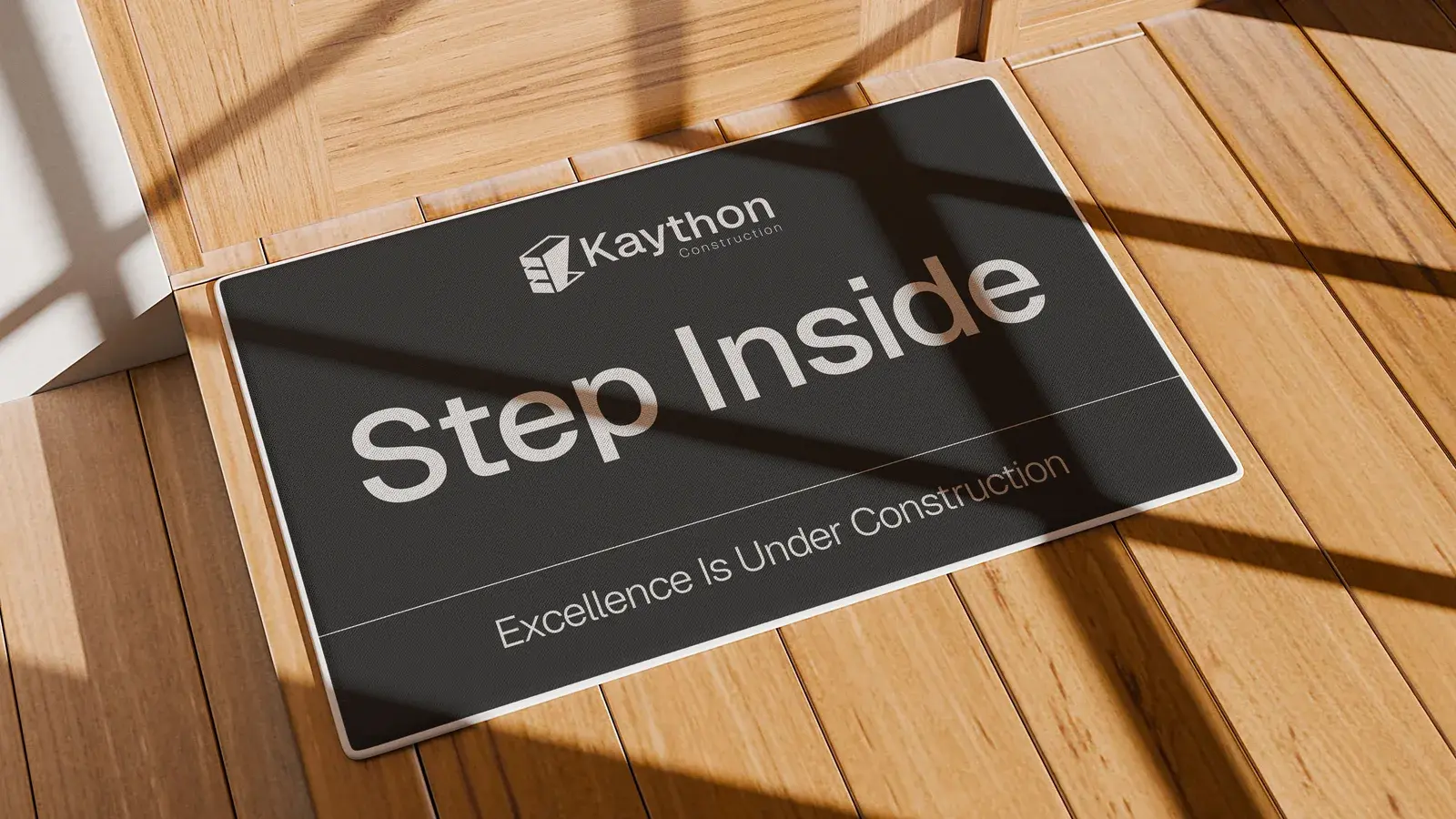
We developed a visual identity rooted in the strength and familiarity of Britain's iconic red brick, combined with the sophistication of modern architectural design. The three-dimensional logo symbolises structural integrity, innovation, and precision, while subtly incorporating the letter “K” to create a distinctive and memorable brand mark. The result is a timeless identity that positions Kayton Construction as a trusted, forward-thinking construction company built on strong foundations and committed to excellence.

Ready to Build Your Brand?
Tell us about your project. We'll take it from there.